
SPEC PROJECT
CHALLENGE
Redesign the packaging for this Austin-based protein powder brand to create a stronger connection with its target audience and give the product a distinct identity.
As a spec project I wanted to continue practicing my design skills for CPG, but also my research skills on translating how a customer thinks about a product and playing off their emotional relationships to it.
Currently, the packaging lacks differentiation and blends in with other protein powders on the market. The goal is to make it visually stand out while reflecting the brand’s unique story and values
DELIVERABLES
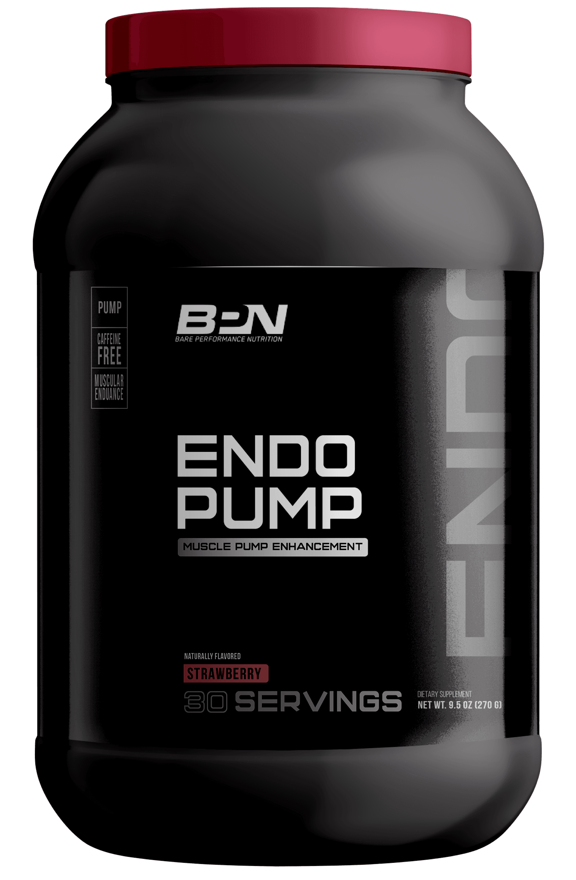
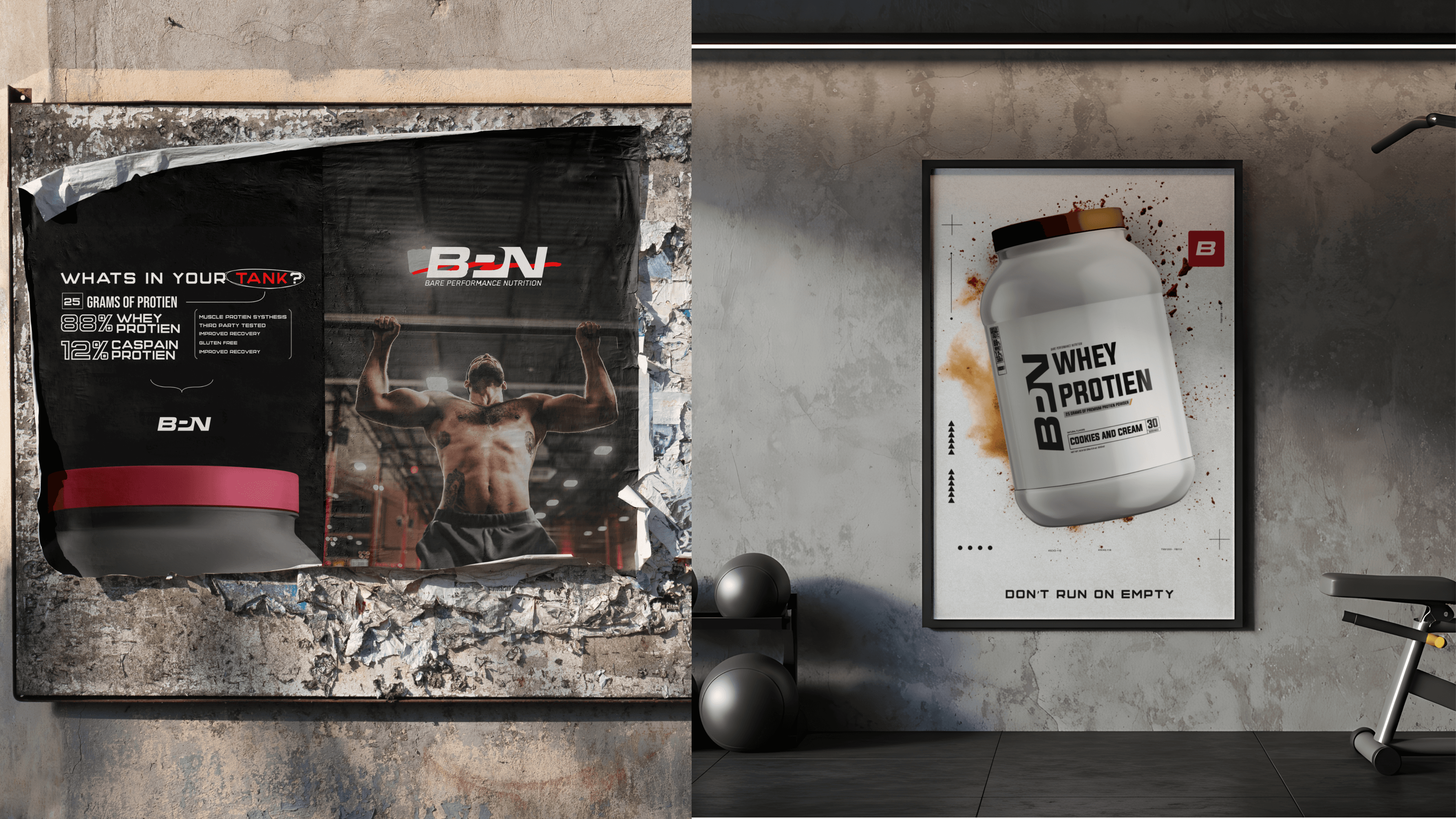
Product Mockups
Poster Ads
.
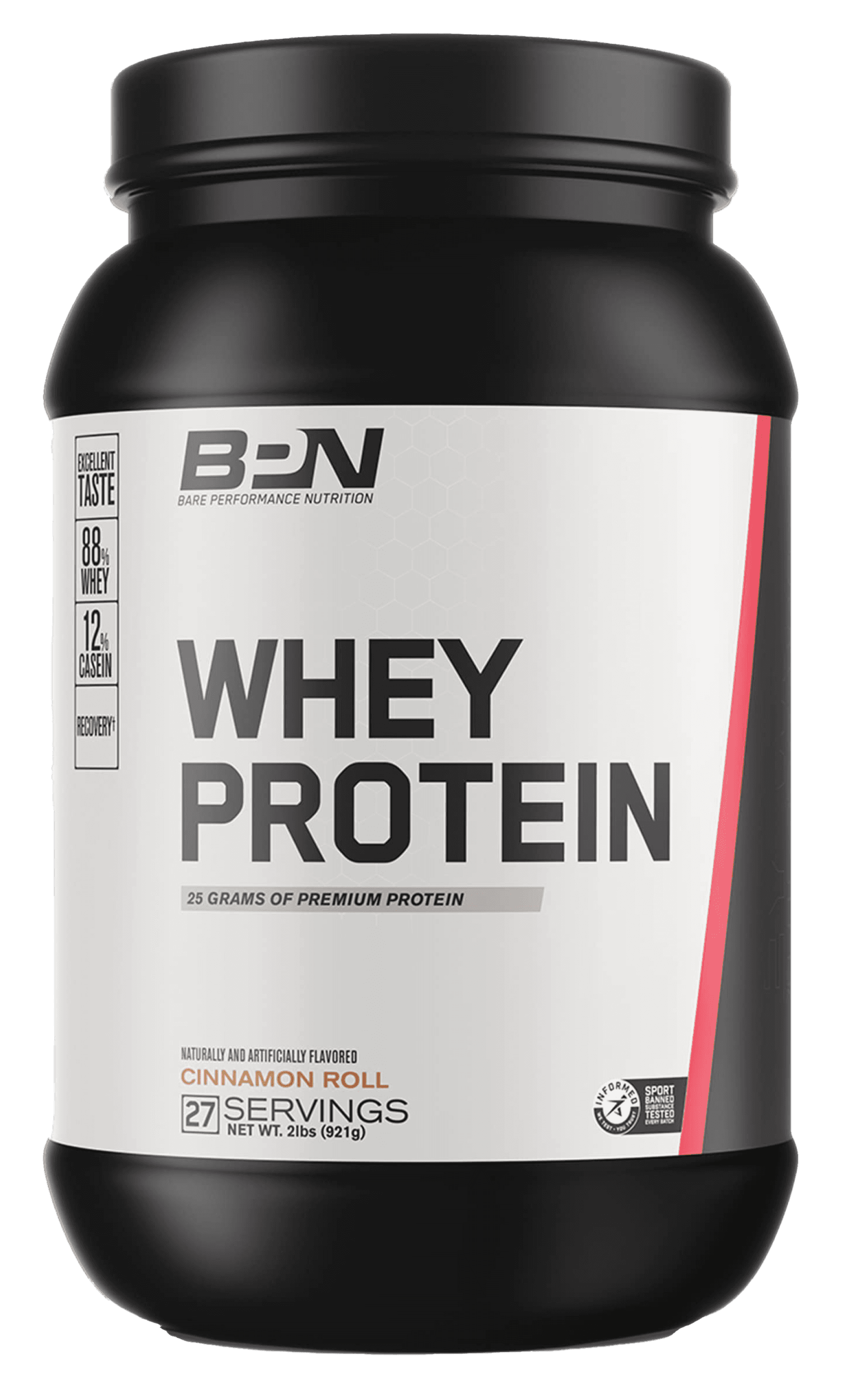
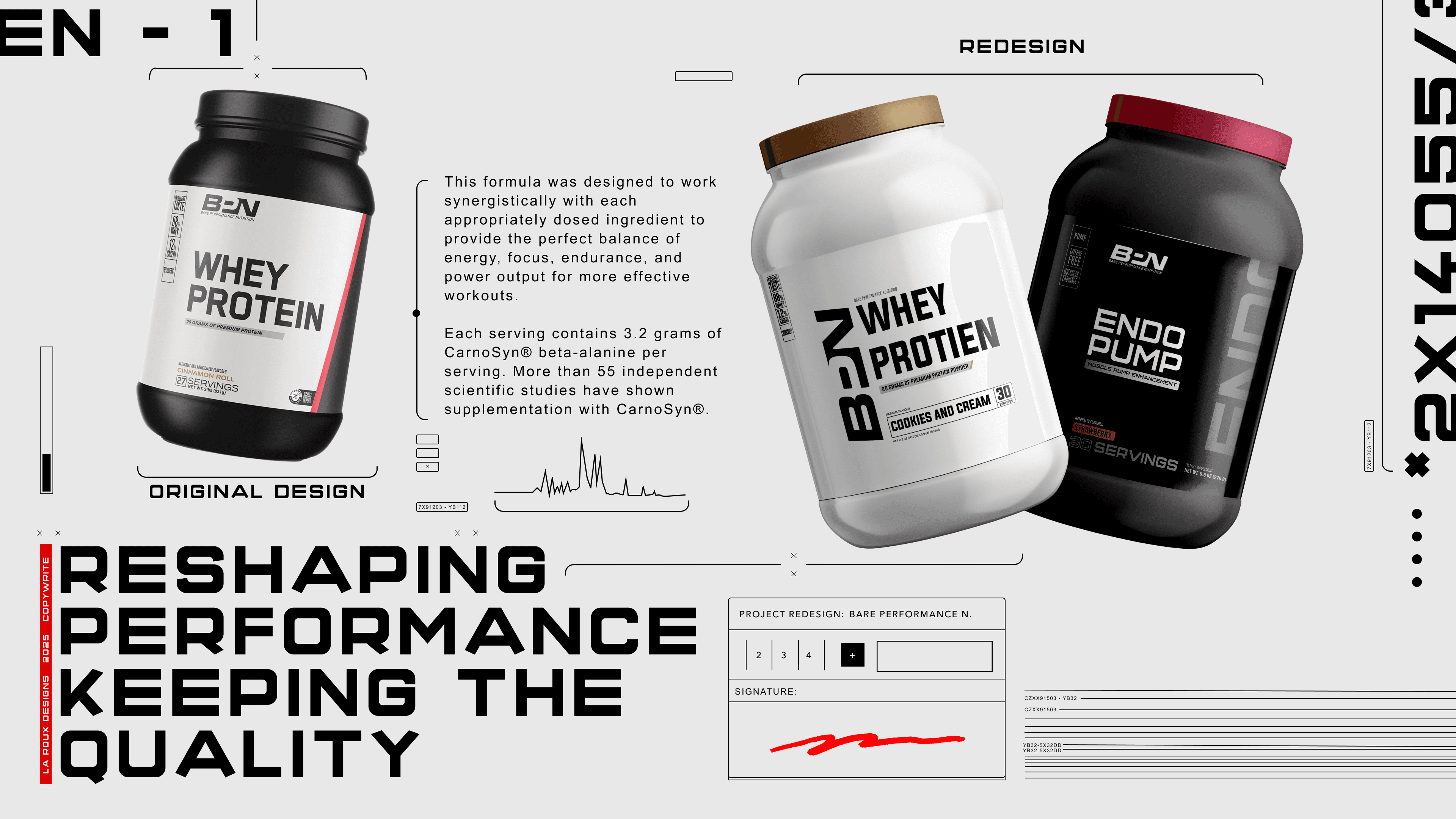
ORIGINAL DESIGN

STARTING POINT
The first step was to articulate the audience’s relationship with protein powder.
At its core, this isn’t just about selling a supplement — it’s about offering a tool that powers performance.
Protein isn’t the end goal;
it’s fuel for the engine: the body.


INSPIRATION
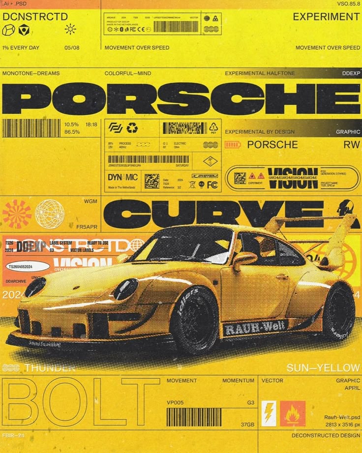
Men who work out regularly often talk about their bodies the same way car fanatics talk about their vehicles.
There's an obsession with fine-tuning, optimizing performance, and pushing limits. The focus on detail, performance metrics, and constant improvement felt strikingly similar.
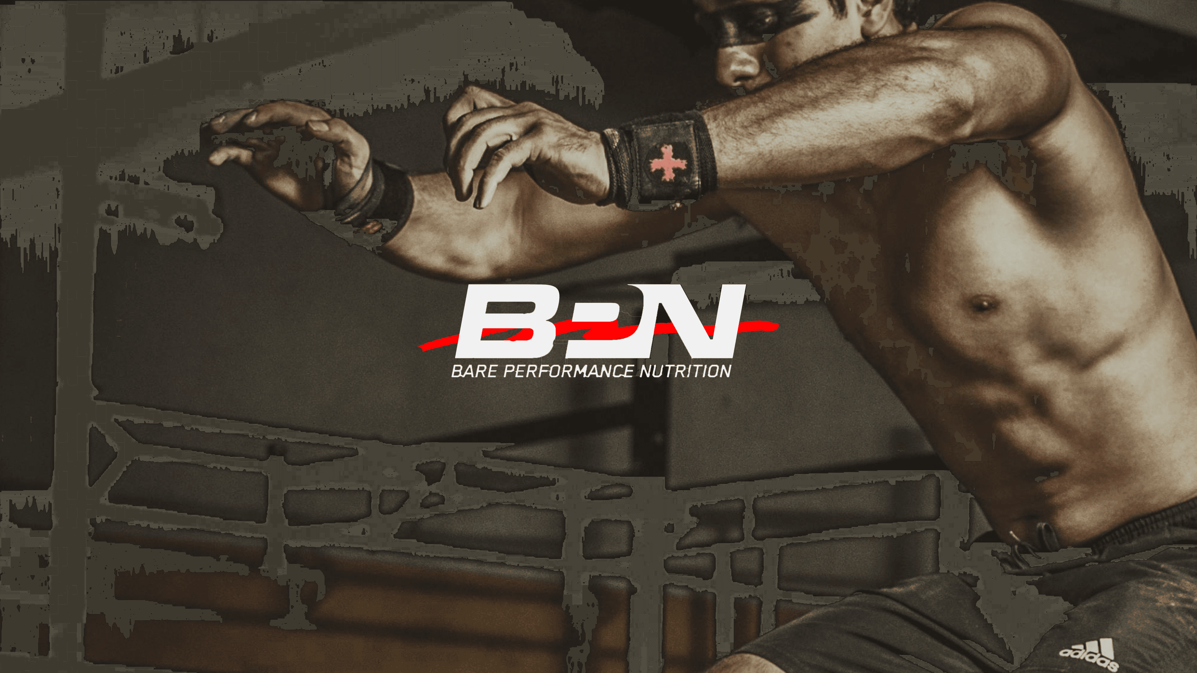
With that in mind, we approached the redesign by borrowing from the bold, performance-driven aesthetic of NASCAR advertising.

REDESIGN

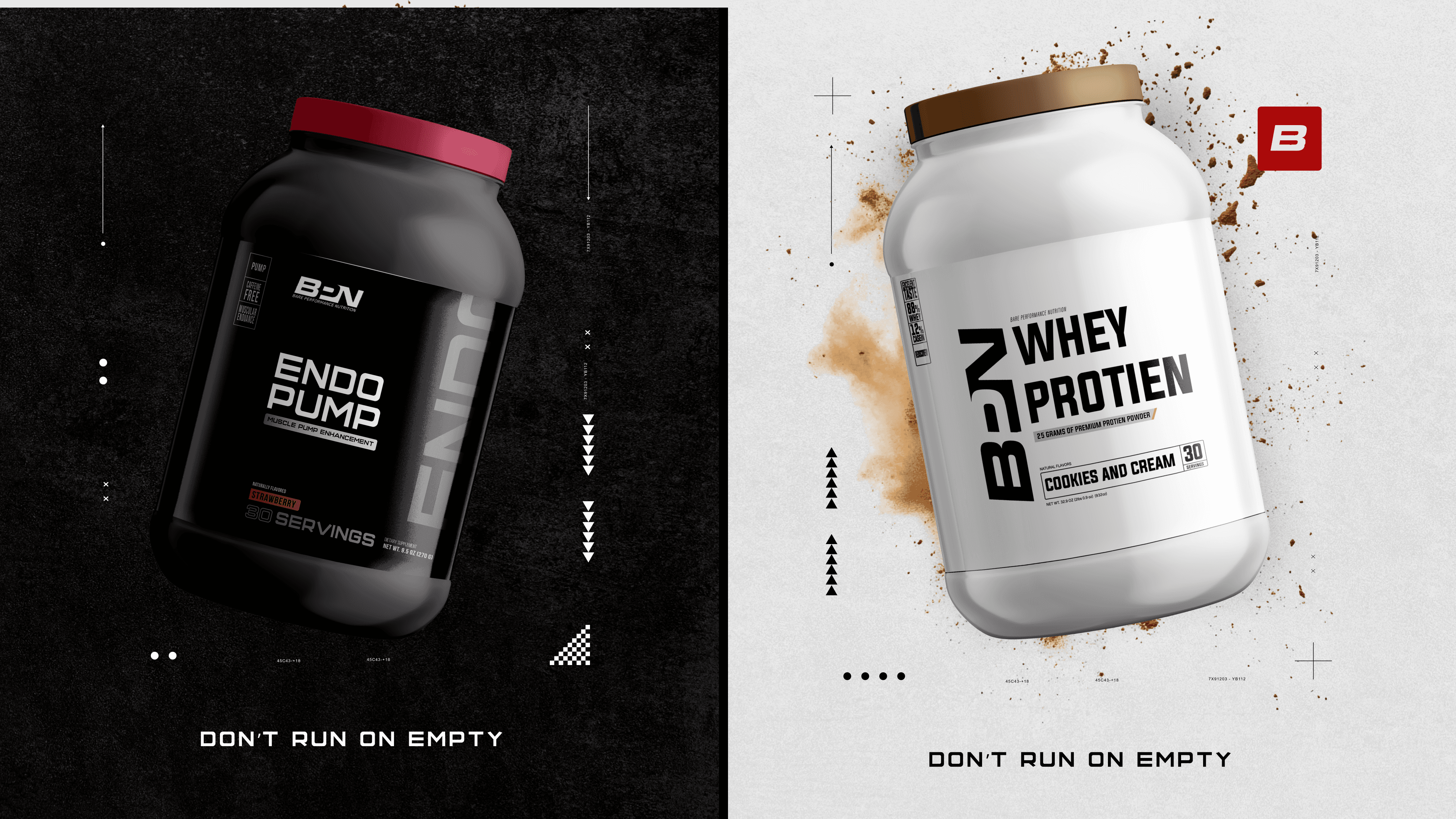
POSTER